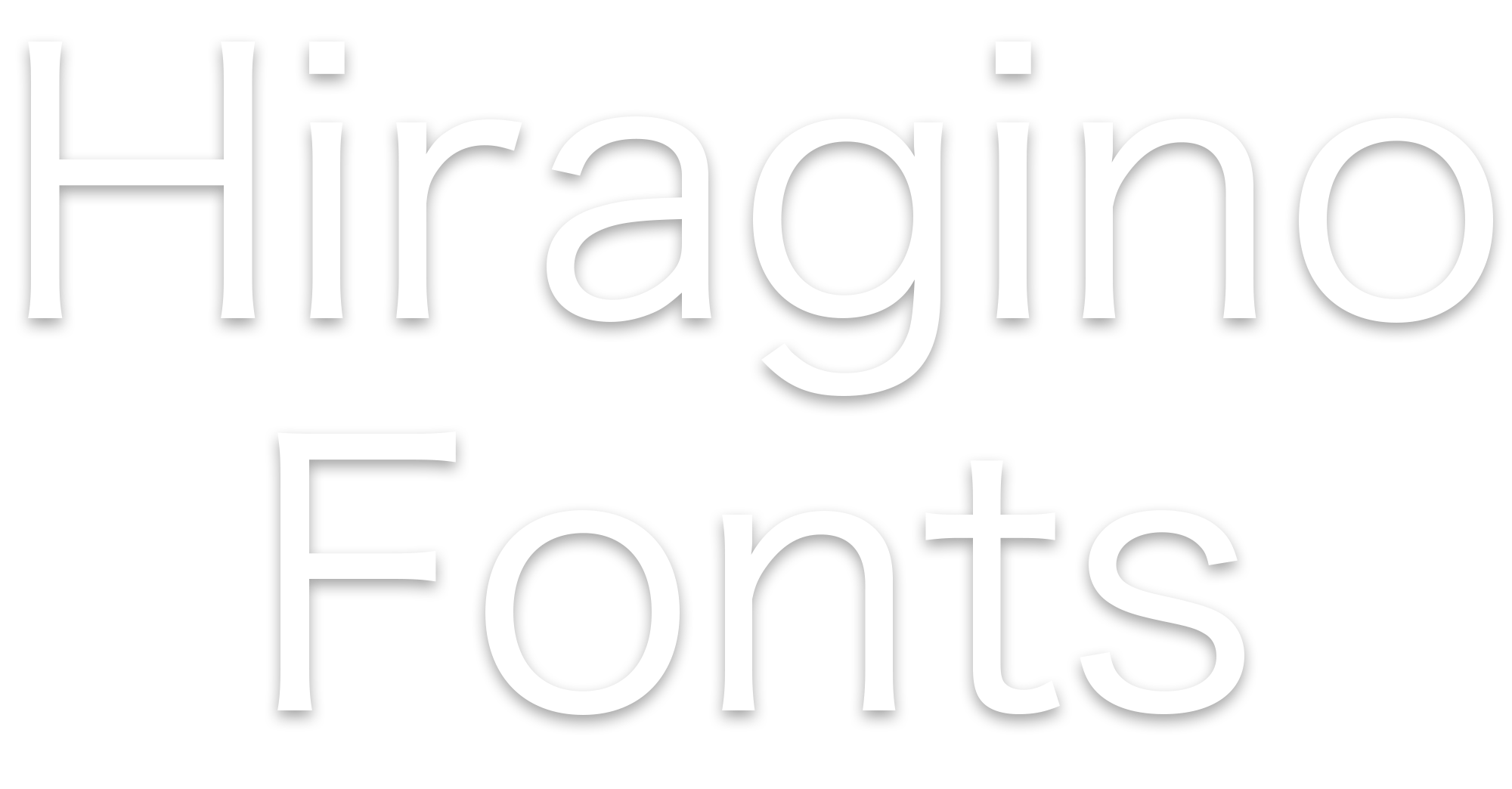
Hiragino’s simplicity, spaciousness and clean lines create a strong visual appeal in any situation. Designed with infinite attention to detail, its finely balanced framework truly embodies a fundamental principle of universal design.


All characters are focused around their natural center of balance to create a fresh, crisp look. The white space backing each character is also visually uniform, ensuring smooth grey tones in any layout. This combination of balance and uniformity allows Hiragino to blend seamlessly with any print visuals.
 High Center of Balance
  Hiragino
  Low Center of Balance
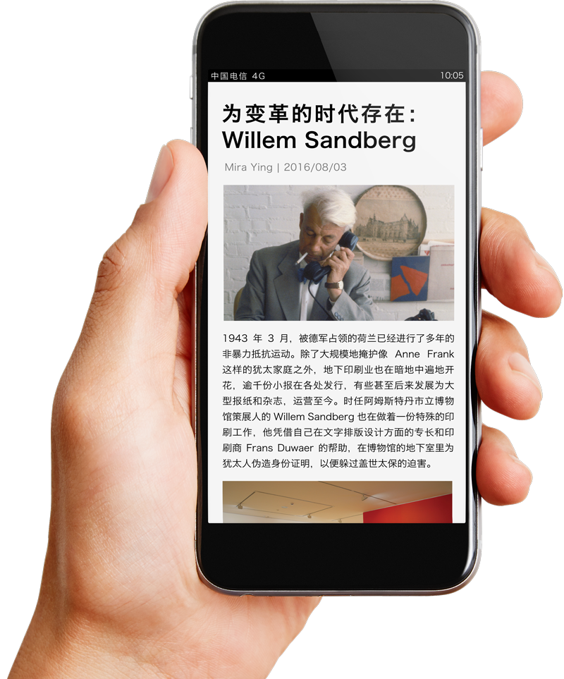
Hiragino has been specially developed for maximum impact in a digital environment. This has involved refining the design of each character down to the smallest detail. Even at small point sizes, characters maintain their dimensions, staying sharp and clear.
 Small Font Face
  Hiragino
  Large Font Face
 Hiragino includes a massive 29,064 simplified Chinese characters. This extensive range helped SCREEN become the first Japanese font maker to receive China’s GB18030-2000 character set certification. Hiragino also fully supports the Adobe-GB1-4 glyph set standard formulated by Adobe Systems.
Hiragino is an original font that embraces a unified design concept for Japanese, Chinese (simplified and traditional) and European characters, as well as symbols and punctuation marks. All elements display the same clean, graceful lines and perfectly balanced finish. Even texts including a mix of languages flow smoothly, creating a unified, highly readable look and feel.
OpenType fonts are available in outline format for embedding in both hardware and software products. We are also happy to discuss any requests for the creation of additional symbols or characters, as well as the customization of both simplified and traditional Chinese or multi-language fonts.
Desktop Fonts
available at
Web Fonts
available at